Creating Bar Charts with Baselines Using Customised Shapes in Plotly
Bar charts are an effective and popular visual to use in reports and dashboard to reveal patterns in the data and difference in groups. In predictive modelling, bar charts can be used to visualise the predicted value such as choice. For example, when given the right data, we will be able to build models to predict which product customers will buy given a specific condition. When conditions change (e.g. increase in price or introduction of a new feature), the predicted choice will also change. In this case, a baseline would be useful for us to understand how much impact certain features have in determining choices. In this post, I will show two methods of adding baselines to Plotly bar charts.
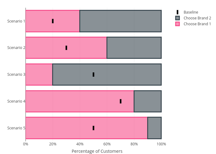
First, let’s create some dummy data. Assuming there are five scenarios and customers will pick Product 1 40%, 60%, 20%, 80% and 90% over Product 2. Let’s also assume the baseline for picking Product 1 for these five scenarios are 20%, 30%, 50%, 70% and 50%. We can create the dummy data as below:
# create some dummy data points
y <- c('Scenario 1', 'Scenario 2', 'Scenario 3', 'Scenario 4', 'Scenario 5')
x1 <- c(0.4, 0.6, 0.2, 0.8, 0.9)
x2 <- 1 - x1
x3 <- c(0.2, 0.3, 0.5, 0.7, 0.5) # this are the baselines
data <- data.frame(y, x1, x2, x3)
The first method is straightforward, we just add baselines using symbols by adding another trace (add_trace). Here we combine the two types of chart into one. If you want something other than dots to represent baselines, you can set the symbol to line-ns in marker option of the trace. Check
this document to see what other symbols you can use.
library(plotly)

p1 <- plot_ly(data, x = ~x1, y = ~y, type = 'bar', orientation = 'h', name = 'Choose Brand 1',
              marker = list(color = 'rgba(246, 78, 139, 0.6)',
                            line = list(color = 'rgba(246, 78, 139, 1.0)',
                                        width = 3))) %>%
    add_trace(x = ~x2, name = 'Choose Brand 2',
              marker = list(color = 'rgba(58, 71, 80, 0.6)',
                            line = list(color = 'rgba(58, 71, 80, 1.0)',
                                        width = 3))) %>%
    # add the dots to indicate the baselines
    add_trace(x = ~x3, y = ~y, type = 'scatter', mode = 'markers', name = 'Baseline', yaxis = 'y',
              marker = list(size = 10,
                            symbol = 'line-ns',
                            line = list(color = 'black',
                                        width = 5)),
              hoverinfo = "text",
              text = ~paste(x3, '% (Baseline)')) %>%
    layout(barmode = 'stack',
           xaxis = list(title = "Percentage of Customers", tickformat = "%"),
           yaxis = list(title ="", autorange="reversed"))

p1
We will get something below. Note that the baselines do not extend over the whole bar because we are just adding symbols there. You can make the symbols larger but I wouldn’t recommend doing that as the graph are not responsive (i.e. the size of the symbols are the same no matter what devises you are using).
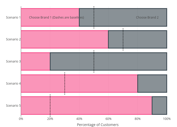
The second method circumvents the scaling issue by adding customised shapes. Adding shapes should be straightforward but the trick here is to set yref = "paper". This will also us to use the whole canvas as reference and properly position the baselines. See the codes below. The drawback here is that we cannot easily add legend and tooltip for the shapes we added.
# initiate a line shape object
line <- list(
type = "line",
line = list(color = "black", dash = 'dot'),
xref = "x",
yref = "paper" # note here we need to use the paper as reference
)
lines <- list()
n_bar <- length(data$x3)
bar_width_ratio <- 1 / n_bar # determine the width of the baselines
# create a list of lists to store the coordinates of the baselines
for (i in 1:n_bar) {
line[c("x0", "x1")] <- data$x3[i]
line[["y0"]] <- (i-1) * bar_width_ratio
line[["y1"]] <- i * bar_width_ratio
lines <- c(lines, list(line))
}
p2 <- plot_ly(data, x = ~x1, y = ~y, type = 'bar', orientation = 'h', name = 'Choose Brand 1',
marker = list(color = 'rgba(246, 78, 139, 0.6)',
line = list(color = 'rgba(246, 78, 139, 1.0)',
width = 3))) %>%
add_trace(x = ~x2, name = 'Choose Brand 2',
marker = list(color = 'rgba(58, 71, 80, 0.6)',
line = list(color = 'rgba(58, 71, 80, 1.0)',
width = 3))) %>%
layout(barmode = 'stack',
xaxis = list(title = "Percentage of Customers", tickformat = "%"),
yaxis = list(title ="", autorange="reversed"),
# add in the baselines as shapes
shapes = lines,
# add in the legend as text annotation
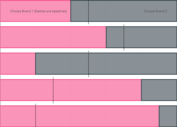
annotations = list(text = list("Choose Brand 1 (Dashes are baselines)", "Choose Brand 2"),
xref = "paper", x = list(0.05, 0.9),
xref = "paper", y = list(0, 0),
showarrow=FALSE),
showlegend = FALSE
)
p2