The Effectiveness of Reducing Population Movement in Managing Coronavirus Outbreak
Simulations of coronavirus outbreak in central Tokyo area based on SIR model and origin-destination flow data
In dealing with the outbreak of the coronavirus, China has slapped extraordinary lockdowns on Wuhan and nearby cities, effectively curbing all movement of over 50 million people. Italy is going to extend the initial lockdowns of northern states to include the whole country. Many cities around the world have cancelled school and advising people to work from home, hoping to contain the virus by reducing movement and contact. The UK government also introduced the virus plan, in which social-distancing measures such as school closures and restrictions on the use of public transport are on the list. But what role transportation plays in spreading the disease in modern megacities? Can these measures be effective?
In this post, I will try to answer these questions by running a couple of simulations based on real-world data. I will use the simple SIR model as a starting point, together with the population density and traffic flow data to simulate a potential outbreak of coronavirus in an urban area. In theory, the outbreak can happen in any city in the world but population and transportation data is not always available. For this post, I will pick Tokyo as an example. It is a megacity with an extensive network of railways, subways and highways and I was also able to get granular transportation and population density data for the area covered in the simulations.
In the next section of the post, I will show the simulations. The model, data and assumptions the simulations are based upon can be found in the later sections.
Simulations
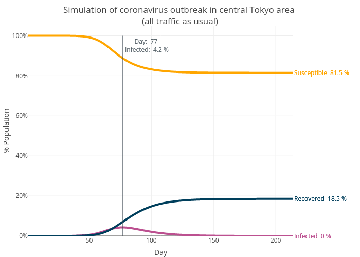
Scenario 1: All traffic as usual
We will focus on the central Tokyo area for all the simulations. This is one of the most populous areas in the world with a population of 14 million. We suppose the outbreak starts in Shinjuku with an initial 100 infected cases. The first simulation assumes all traffic as usual, which provides a baseline. The graph below shows the time series of susceptible, infected and recovered, as the proportion of the total population. The simulation suggests the outbreak lasts about 200 days with 18.5% of the population infected (the simulation stops when there are no new cases). Due to the assumptions made, this is probably close to the worst-case scenario and the real-life infected cases are very unlikely to be this high.
Below is a time-lapse visualisation of the outbreak. It starts from Shinjuku, then travels west and south-west before spreading to the central and east part of the city. This pattern is likely due to the population density and traffic flow of Tokyo. (Sorry that I have to take down the good quality GIFs and replaced them with YouTube video but I can’t afford the bandwidth!)
This pattern can be seen more clearly when we show it at the 10-day interval. I have also labelled the districts for context.
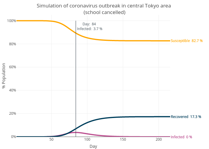
Scenario 2: Schools cancelled
Let’s see what will happen if the schools are cancelled. According to the OD Flow data, 6.4% of the trips in the Tokyo area are trips related to school. However, the percentage would be higher as the data group all the return-to-home trips together, making it impossible to separate the return-to-home-from-school trips from others. For this simulation, I will simply use the data that is clearly labelled as school trips. We will take these out and re-run the simulation with the same settings. The graph below shows that the outbreak now peaks at Day 84 and a total of 17.3% of the population are infected, a 6.5% reduction from the first scenario.
The spread pattern is similar to what we have seen before. This is not surprising given that we would expect the disease can still be spread to other places by other people.
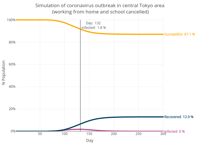
Scenario 3: People working from home and school cancelled
Finally, we will simulate the scenario where people are also advised to work from home. This reduces the trips by a total of 30%. Again, this number could be lower than it should be due to the data issues described above, potentially underestimating the effect of “working from home”. Still, the simulation shows that the peak of the outbreak is pushed back to Day 132 and only 12.9% of the population is infected ( a 30% reduction from Scenario 1).
Because the outbreak has been “stretched” longer, we can see the west-to-east pattern more clearly, with the infection moving from one district to another, rather than affecting all the districts at the same time (as we have seen in Scenario 1 and 2).
What do the simulations tell us
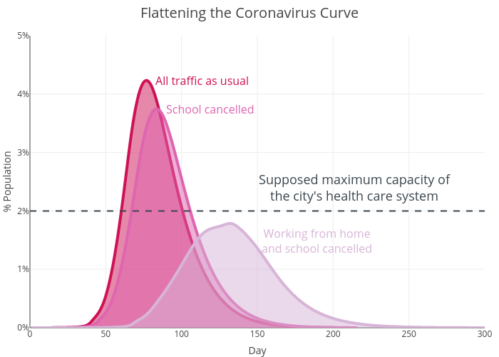
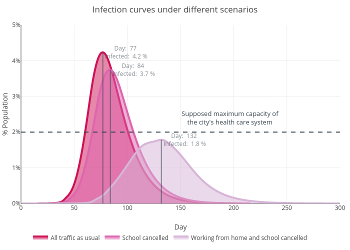
Can measures that reduce population movement such as cancelling school and advising people to work from home be effective? Almost certainly. The graph below compares the infection curves of the three scenarios. In the “no school, work from home” scenario, the curve is not only shorter (meaning less infection at the peak of the outbreak) but also much flatter (meaning the number of infection grows much slower at the beginning of the outbreak). Let’s suppose when operating with maximum capacity, the health care system of Tokyo can only cope with 2% of the population being infected (as shown by the dashed line). The first scenario (“all traffic as usual”) would be a disaster as the number of patients grow too quickly and overwhelms the health care system in just 60 days, with 4.2% infected at the peak time. Cancelling the school (the second scenario) delays and lowers the peak but it is probably not enough. The final scenario (advising people to work from home and cancelling school) lowers the peak to 1.8% and makes it take twice of the time (132 days) to reach the peak, greatly reducing the pressure on the health care system. This also means that the outbreak could last longer overall (300 days vs 200 days as shown by the simulations, albeit the long tail only accounts for a small proportion of the infection). Previously, we also learned that the “no school, work from home” scenario leads to overall fewer people being infected. Counting all these together, it is understandable that the UK government has a “delay” phase in the virus plan and why it says “managing the coronavirus outbreak is a marathon, not a sprint”.
Model
The simulations are based on the simple SIR model, which computes the theoretical number of people infected with a contagious illness in a closed population over time. I first encountered this model in one of the episodes of the American crime drama Numb3rs, in which the math genius Charlie attempts to use the model to locate the point of origin of a bioterrorist attack. The model assumes there are three compartments in outbreaks of infectious diseases, S for the number susceptible, I for the number of infectious, and R for the number recovered (or immune). Susceptible people catch the disease and become infectious. He/she may pass the disease to other people before recovering. Once recovered, he/she become immune and can no longer catch the disease again. The model is dynamic, meaning that people can move from one compartment to another following the order of S -> I -> R (but not the other way around). This can be expressed by the following equations:
$$\frac{dS}{dt} = -\frac{\beta IS}{N}$$ $$\frac{dI}{dt} = \frac{\beta IS}{N} - \gamma I$$ $$\frac{dR}{dt} = \gamma I,$$
where S is the stock of susceptible population, I is the stock of infected, and R is the stock of recovered population. $\beta$ and $\gamma$ are the transition rates between different compartments. For example, the transition rate between S and I is $\beta$, which can be defined as the average number of contacts per person times the probability of disease transmission in one contact between a susceptible and an infectious subject. Between I and R, the transition rate is $\gamma$, which is simply the rate of recovery or death. If the duration of the infection is $D$, then $\gamma = \frac{1}{D}$, since the infected group see one recovery/death in $D$ units of time.
$R_{0}$, the basic reproduction number of the virus that has been wildly quoted, can be derived from $\beta$ and $\gamma$.
$$R_{0} = \frac{\beta }{\gamma }$$
$R_{0}$ is defined as the number of secondary infections caused by a single primary infection; in other words, it determines the number of people infected by contact with a single infected person before his/her death or recovery.
Now we have the basic model of the spreading of the infectious disease. But how can we link this to the transportation system of a city? For this, Urban Data Scientist Gevorg Yeghikyan found a good solution based on a Nature article. The hazard of introducing an infectious disease to a new location can be expressed below:
$$ h(t,j)=\frac{\beta_{t}S_{j,t}(1-\exp(-\sum_{k}m^{_{j,k}^{t}}x_{k,t}y_{j,t}))}{1+\beta_{t}S_{j,t}}, $$
where $\beta_{t}$ is the S-I transition rate at time $t$, $m^{_{j,k}^{t}}$ reflects mobility from location $k$ to location $j$ at time $t$; $x_{k,t}$ and $y_{j,t}$ denote the proportion of infected and susceptible population at location $k$ and $j$ at time $t$, which can be expressed as below:
$$x_{k,t}=\frac{I_{k,t}}{N_{k}}$$ $$y_{j,t}=\frac{S_{j,t}}{N_{j}},$$
where $I_{k,t}$ and $S_{j,t}$ are the total infected and susceptible cases at location $k$ and $j$, $N_{k}$ and $N_{j}$ are the total population of the two locations. Combining the above probability of introducing the disease into a new location with the SIR model we get:
$$S_{j,t+1}=S_{j,t}-\frac{\beta_{j,t}S_{j,t}I_{j,t}}{N_{j}}-\frac{S_{j,t}\sum_km_{j,k}^tx_{k,t}\beta_{k,t}}{N_{j}+\sum_km_{j,k}^t}$$
$$I_{j,t+1}=I_{j,t}+\frac{\beta_{j,t}S_{j,t}I_{j,t}}{N_{j}}+\frac{S_{j,t}\sum_km_{j,k}^tx_{k,t}\beta_{k,t}}{N_{j}+\sum_km_{j,k}^t}-\gamma I_{j,t}$$
$$R_{j,t+1}=R_{j,t}+\gamma I_{j,t}$$
This just means that at a given time and a given location, the number of infected cases consist of people who are infected within the location ($\frac{\beta_{j,t}S_{j,t}I_{j,t}}{N_{j}}$) and those who arrive from other locations ($\frac{S_{j,t}\sum_km_{j,k}^tx_{k,t}\beta_{k,t}}{N_{j}+\sum_km_{j,k}^t}$), which is calculated accounting for the flow of population. For this version, we are going to play down the effect of local transmission so that we can see the effect of population movement clearly. From here, the simulations can be built using simple matrix calculation and loops. We are essentially creating a combination of two markov processes, one is the process from susceptible to infected to recovered and the other is the process of disease spreading from one location to another. The simulations run through the markov chain iteratively.
Assumptions
Modelling the spread of an infectious disease is hard as the system is dynamic and complicated. For the sake of simplicity, the following assumptions are made for the simulations in this post:
- The average transition rate between susceptible and infectious ($\beta$) is 0.3; in the simulation, we assume the $\beta$ in each cell is from a gamma distribution with a mean of 0.3 and scale of 2.
- The transition rate between infectious and recovered ($\gamma$) is 0.1, meaning the average recovery day is 10.
- The above means that we assume the average $R_{0}$ is 3, which sits in the middle of the estimation by scientists.
- The SIR model does not consider the incubation period nor the possibility that the ability to pass on the disease can vary in different stages. It simply assumes people will become contagious once they are infected. This is a strong assumption.
- We assume that people’s mobility won’t change when they have the disease. Again, this is also a strong assumption.
- No measure (e.g. quarantine, isolation, hospitalisation) is taken to tackle the outbreak.
- The outbreak starts from a populous and well-connected area (e.g. Shinjuku) with an initial 100 infected cases.
These assumptions probably mean that the simulations are based on the ideal scenario and it is very unlikely that we are going to see it in real life. However, the simulations can still provide a scope to see the role of transportation and human movement play in a potential outbreak in megacities.
Data
To model the spread of the disease we need to know the pattern of movement in a typical day. I have found the “Traffic Flow: Person Trip OD Amount Data” from Japan National Land Numeric Information website. The dataset has OD (origin-destination) amounts by the purpose and by the transportation means between zones derived from surveys on person trips in three major metropolitan areas (Tokyo urban area, Kinki Urban Area, and Chukyo urban area). I used a subset of the Tokyo urban area data.
We also need to know the population in each of the simulated locations. This kind of information is available through the format of raster file, which I got from WorldPop. The original resolution is 100 m2. Simulating at this resolution in the central Tokyo area would generate hundreds of millions of cells, which is not practical. I, therefore, used a much lower resolution at 1 km2. This still makes the population data at a finer level than the OD flow data which is at zone-level (i.e. sub-district). I have matched the two datasets by making a couple of simple assumptions.
Combining these two datasets we have something below. The heatmap shows the population density while the lines are OD flows.